library(tidyverse)
library(skimr)hydrowaste
Tidy Tuesday, 2021-01-05
this is tidytuesday data on wastewater treatment plants
tuesdata <- tidytuesdayR::tt_load(2022, week = 38)
Downloading file 1 of 1: `HydroWASTE_v10.csv`tuesdata
df_raw <- tuesdata |>
pluck(1) |>
type_convert() |>
janitor::clean_names()the data has country locations, longitude/latitude,countries, population served, waste water discharge levels, location from coastal areas and is the waste treatment plant at designed quantity level. The plants have different statuses from closed to operational.
possible business questions: - which countries have the highest waste water discharge levels? If we thing about financial support on water treatment plants, which countries should we focus on to get highest impact? - what countries has the worst water treatment plants per capita? This linked to impact value of possible monetary support. - the presence of coastal areas information in the data is also interesting to approach the problem from the perspective of water quality and marine life.
df_raw |> skim()| Name | df_raw |
| Number of rows | 58502 |
| Number of columns | 25 |
| _______________________ | |
| Column type frequency: | |
| character | 5 |
| numeric | 20 |
| ________________________ | |
| Group variables | None |
Variable type: character
| skim_variable | n_missing | complete_rate | min | max | empty | n_unique | whitespace |
|---|---|---|---|---|---|---|---|
| wwtp_name | 5290 | 0.91 | 1 | 202 | 0 | 49233 | 0 |
| country | 0 | 1.00 | 4 | 32 | 0 | 188 | 0 |
| cntry_iso | 0 | 1.00 | 3 | 3 | 0 | 180 | 0 |
| status | 0 | 1.00 | 6 | 22 | 0 | 9 | 0 |
| level | 0 | 1.00 | 7 | 9 | 0 | 3 | 0 |
Variable type: numeric
| skim_variable | n_missing | complete_rate | mean | sd | p0 | p25 | p50 | p75 | p100 | hist |
|---|---|---|---|---|---|---|---|---|---|---|
| waste_id | 0 | 1.00 | 29251.50 | 1.688822e+04 | 1.00 | 14626.25 | 29251.50 | 4.387675e+04 | 5.850200e+04 | ▇▇▇▇▇ |
| source | 0 | 1.00 | 3.25 | 3.390000e+00 | 1.00 | 1.00 | 2.00 | 4.000000e+00 | 1.200000e+01 | ▇▁▁▁▁ |
| org_id | 0 | 1.00 | 7594239906.92 | 1.502416e+10 | 1.00 | 4000.25 | 1296386.50 | 1.000290e+09 | 7.800000e+10 | ▇▁▁▁▁ |
| lat_wwtp | 0 | 1.00 | 35.13 | 2.244000e+01 | -54.79 | 33.49 | 41.72 | 4.846000e+01 | 7.164000e+01 | ▁▁▁▇▅ |
| lon_wwtp | 0 | 1.00 | -14.64 | 6.753000e+01 | -175.30 | -81.64 | 2.15 | 1.665000e+01 | 1.784800e+02 | ▁▆▇▁▁ |
| qual_loc | 0 | 1.00 | 2.03 | 6.400000e-01 | 1.00 | 2.00 | 2.00 | 2.000000e+00 | 4.000000e+00 | ▂▇▁▁▁ |
| lat_out | 0 | 1.00 | 35.13 | 2.244000e+01 | -54.80 | 33.48 | 41.71 | 4.846000e+01 | 7.164000e+01 | ▁▁▁▇▅ |
| lon_out | 0 | 1.00 | -14.64 | 6.753000e+01 | -175.30 | -81.63 | 2.16 | 1.668000e+01 | 1.784300e+02 | ▁▆▇▁▁ |
| pop_served | 0 | 1.00 | 39273.73 | 1.536832e+05 | 0.00 | 1388.00 | 4613.50 | 1.991100e+04 | 1.014613e+07 | ▇▁▁▁▁ |
| qual_pop | 0 | 1.00 | 1.99 | 9.500000e-01 | 1.00 | 1.00 | 2.00 | 2.000000e+00 | 4.000000e+00 | ▆▇▁▂▂ |
| waste_dis | 0 | 1.00 | 8916.56 | 4.468567e+04 | 0.00 | 340.69 | 1079.00 | 4.428930e+03 | 3.073754e+06 | ▇▁▁▁▁ |
| qual_waste | 0 | 1.00 | 2.22 | 1.450000e+00 | 1.00 | 1.00 | 1.00 | 4.000000e+00 | 4.000000e+00 | ▇▁▁▁▆ |
| qual_level | 0 | 1.00 | 1.19 | 3.900000e-01 | 1.00 | 1.00 | 1.00 | 1.000000e+00 | 2.000000e+00 | ▇▁▁▁▂ |
| df | 11200 | 0.81 | 279284.87 | 7.460834e+06 | 1.00 | 105.88 | 569.62 | 3.784690e+03 | 7.029366e+08 | ▇▁▁▁▁ |
| hyriv_id | 379 | 0.99 | 41913715.43 | 2.329755e+07 | 10000009.00 | 20409188.00 | 40182395.00 | 7.049991e+07 | 8.032324e+07 | ▇▁▂▁▆ |
| river_dis | 10551 | 0.82 | 391.84 | 5.173560e+03 | 0.00 | 1.72 | 6.54 | 3.797000e+01 | 1.271052e+05 | ▇▁▁▁▁ |
| coast_10km | 0 | 1.00 | 0.18 | 3.800000e-01 | 0.00 | 0.00 | 0.00 | 0.000000e+00 | 1.000000e+00 | ▇▁▁▁▂ |
| coast_50km | 0 | 1.00 | 0.33 | 4.700000e-01 | 0.00 | 0.00 | 0.00 | 1.000000e+00 | 1.000000e+00 | ▇▁▁▁▃ |
| design_cap | 15835 | 0.73 | 23981.77 | 1.215321e+05 | 0.00 | 1022.06 | 4200.00 | 1.409900e+04 | 1.120625e+07 | ▇▁▁▁▁ |
| qual_cap | 0 | 1.00 | 1.96 | 7.600000e-01 | 1.00 | 1.00 | 2.00 | 3.000000e+00 | 3.000000e+00 | ▆▁▇▁▅ |
etl
waste_dis and pop_served has 0 values which can skew eda metrics later on. I will replace them with NA values. continent is parsed from iso3c code with contrycode package.
df <- df_raw |>
  mutate(
    # replace waste_dis and pop_server 0 with NA
    across(c(waste_dis, pop_served), ~ na_if(., 0))
  ) |>
  mutate(
    waste_ratio = waste_dis / pop_served,
    continent = countrycode::countrycode(cntry_iso, "iso3c", "continent"),
    .before = 1
  )
eda
continents_agg <- df |>
  summarise(
    plants = n(),
    avg_pop_served = mean(pop_served, na.rm = T), ,
    avg_disposal = mean(waste_dis, na.rm = T),
    avg_waste_ratio = mean(waste_ratio, na.rm = T),
    .by = c(continent)
  ) |>
  arrange(-plants) |>
  filter(!is.na(continent))
Americas and africa have larger average wastewater distarge per capita compared to Europe and Asia. what is the industry standard for wastewater discharge per capita?
continents_agg# A tibble: 5 × 5
continent plants avg_pop_served avg_disposal avg_waste_ratio
<chr> <int> <dbl> <dbl> <dbl>
1 Europe 26971 25893. 5198. 0.231
2 Americas 22926 22577. 7583. 0.549
3 Asia 5503 175878. 33705. 0.280
4 Oceania 1578 12945. 3572. 0.326
5 Africa 1518 79821. 14530. 4.47 level and continent
is there difference on plant level and continent?
plant_levels <- df |>
  summarise(
    n = n(),
    avg_waste_ratio = mean(waste_ratio, na.rm = T),
    .by = c(continent, level)
    # ratio = n / total
  ) |>
  arrange(-n)
most of the advanced plants are in Europe and Asia. Africa has the most plants in the basic level.
plant_levels |>
  ggplot(aes(continent, n, fill = level)) +
  geom_col()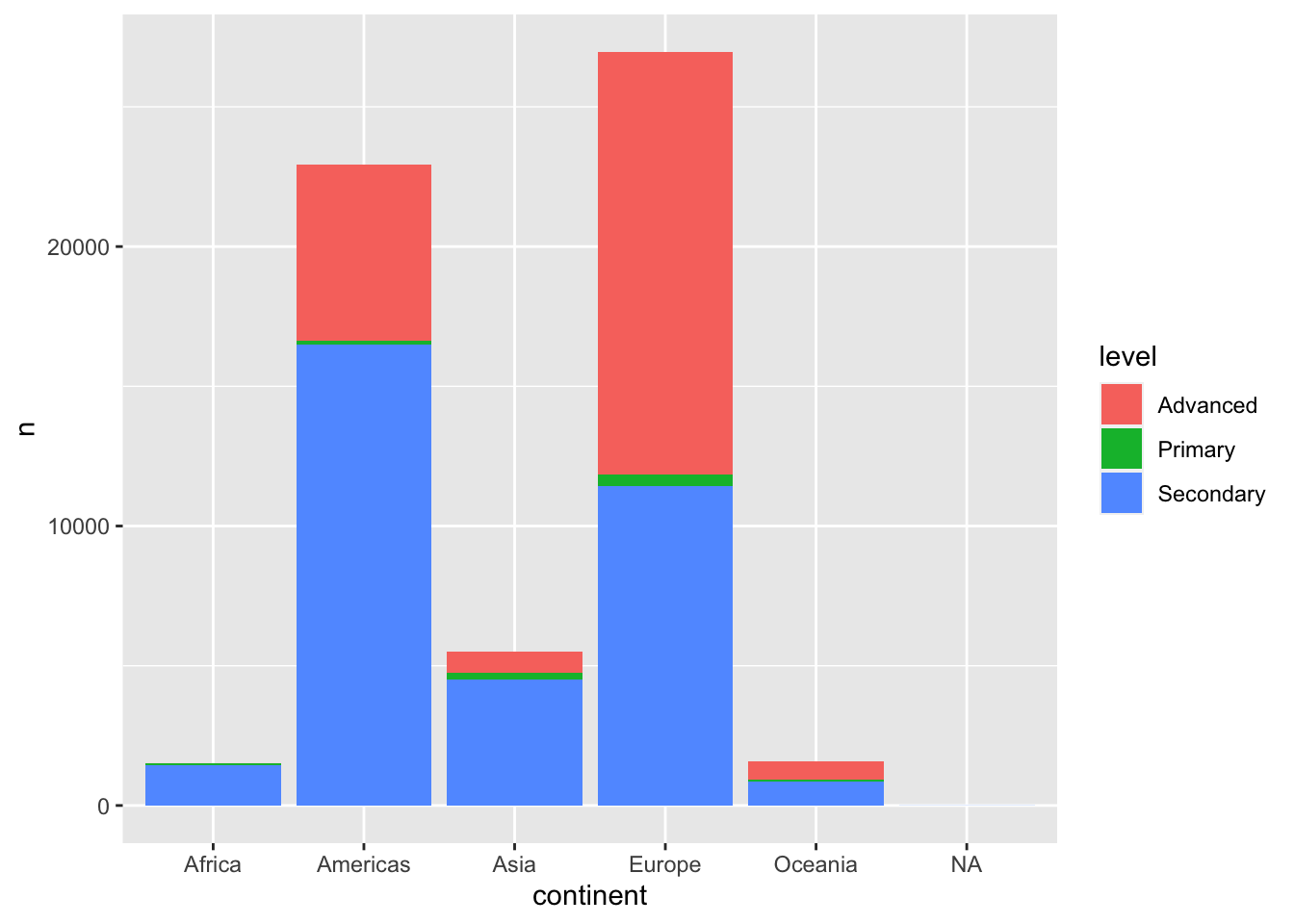
plant_levels |>
  ggplot(aes(continent, avg_waste_ratio, fill = level)) +
  geom_col()
europe and africa seems to have outliers in waste discharge per capita.
df |>
  # ggplot avg_pop_served and avg_wastewater_disposal
  ggplot(aes(waste_ratio, continent, color = level)) +
  geom_jitter(alpha = 0.5) +
  scale_x_log10() +
  labs(
    title = "waste water discharge per capita",
    subtitle = "waste water discharge per capita by continent and level",
    caption = "data: tidytuesdayR::hydrowaste",
    x = "waste water discharge per capita",
    y = "continent"
  )
plants close to coast
# plot coast_10km with waste_ratio
df |>
  ggplot(aes(level, waste_ratio, color = as_factor(coast_10km))) +
  geom_jitter(alpha = 0.5) +
  scale_y_log10() +
  labs(
    title = "waste water discharge per capita",
    subtitle = "waste water discharge per capita by distance to coast and level",
    color = "Coast, 10km",
    x = "distance to coast",
    y = "waste water discharge per capita"
  )
waste water plants in Finland
df |>
  filter(country == "Finland") |>
  summarize(avg_waste_ratio = mean(waste_ratio, na.rm = T))
# A tibble: 1 × 1
avg_waste_ratio
<dbl>
1 0.164https://evamaerey.github.io/flipbooks/geom_sf/geom_sf.html#50
below is a map of waste water treatment plants in Finland. The color of the points is the waste ratio, which is the waste discharge per capita. The darker the color, the higher the waste discharge per capita. The map shows that the waste discharge per capita is higher in the south of Finland, which is the most populated area.
library(sf)
library(rnaturalearth)

fi <- ne_countries(
  scale = "medium", returnclass = "sf"
) %>%
  select(name, continent, geometry) %>%
  filter(name == "Finland")

df |>
  filter(country == "Finland") |>
  # View()
  st_as_sf(coords = c("lon_wwtp", "lat_wwtp"), crs = 4326, remove = FALSE) |>
  ggplot() +
  geom_sf(data = fi) +
  geom_point(aes(lon_wwtp, lat_wwtp, color = waste_ratio), alpha = .7, size = 2) +
  scale_color_viridis_c()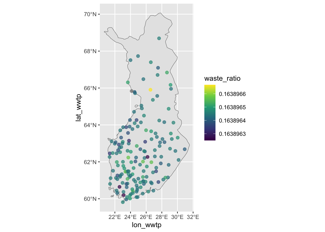
model
what describers the waste discharge per capita?
library(tidymodels)
tidymodels_prefer()
pca to understand the variance
df_pca <- df |>
  recipe(waste_ratio ~ .) |>
  step_select(-c(wwtp_name, status, waste_id, source, org_id, df, ends_with("wwtp"), ends_with("out"))) |>
  step_impute_mean(all_numeric_predictors()) |>
  step_normalize(all_numeric_predictors()) |>
  step_pca(all_numeric_predictors(), num_comp = 3) |>
prep()- first qual_ component seems to be data quality layer, which has minimal impact on the actual analysis.
- the second component is linked to the waste water service level.
df_pca |>
  tidy(4) |>
  filter(component %in% str_glue("PC{1:4}")) |>
  mutate(component = fct_inorder(component)) |>
  ggplot(aes(value, terms, fill = terms)) +
  geom_col(show.legend = FALSE) +
  facet_wrap(vars(component), nrow = 1) +
  labs(title = "what features contribute to waste ratio (per capita)", y = NULL)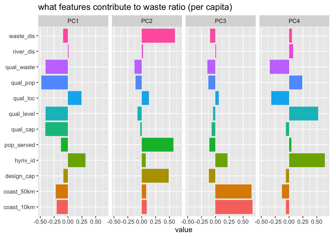
conclusion
generally the data features describe more on the data source quality. I think, to conduct deeper analysis one would need to join different data set depending if the problem is linked to funding allocation or for fixing plants that are close to sea, and therefore risk of contamination.